Our Blog.

A Strong Yield In IT Management Results.

post-image

As the executive training arm of the School of Computing, National University of Singapore (NUS), Strategic Technology Management Institute (STMI) is chartered to meet the ever changing needs of the infocomm industry. Through combining the best in conceptual theory and knowledge with real world application, STMI has established itself as a leading IT management and leadership course provider.

The Tangram team has been working closely with STMI over the past years in developing creative advertisement visuals and course materials that fulfill their marketing purposes. Bearing in mind the target audience of IT professionals in leadership roles, our ad copy and key visuals have constantly been tuned towards delivering the right key messages.

Our latest ad campaign with STMI was a challenging project involving 2 other parties including Workforce Development Agency (WDA) as well as Development Bank of Singapore (DBS). With a growing importance of IT across all industries, we sure look forward to many more exciting projects to come!

Roses are Red but Violets are not blue!!!

post-image

While many would say violet is a form of blue, technically speaking, it is actually a real colour, located somewhat between blue and purple. Have a look at what you can achieve with one of the oldest colours used by man!

Fit for a King? Since ancient times, violet has always exuded an air royalty, wealth and luxury. Being a mixture of red and blue, it has the properties of both warm and cool. It is thus a favourite colour among many luxury brands and its related product logos.

Take a break Violet has a variety of effects on the mind and body, aiding spirituality and contemplation. It also uplift spirits, enhance the sacred, increase nurturing tendencies and sensitivity. Meditation is often made more powerful with the presence of this colour.

Let loose your imagination! Violet is also believed to promote imagination and creativity. It is said that with its magic and mystery, artists, musicians, writers, poets and psychics have been greatly inspired by this colour.

Feeling the blues? In colour therapy, violet is often associated with our emotions and has the effect of calming the mind and nerves. This makes it ideal in relieving migraine headaches and suppressing of appetite.

5 Tips on Effective Logo Design

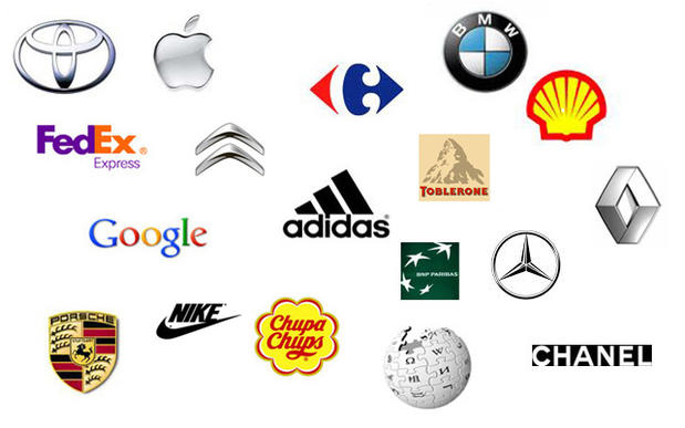
A logo can be best described as a symbol that reflects the persona of an entire organisation. While there are countless long lasting logos that withstand the test of time (think Nike & McDonalds), many remain baffled at how something so simple can make such a drastic difference in shaping the brand of a successful company. Here, we take a look at 5 guiding principles of creating a stunning yet impactful logo.

Simple As the saying goes, less is more. Having a visually distracting and cluttered logo is always the easiest way to shut down the attention span of any living person. As we vie for attention in an increasingly complex marketplace, a simplistic logo can sometimes convey a message to your audience most easily and effectively.

Memorable While many may argue on the definition of memorable, we prefer it in a positive light. A well-designed and distinctive logo that strikes an impression on anyone is likely to enhance top-of-mind awareness in your target audience. With heightened brand recall, it probably translates to more sales.

Timeless Design trends are fleeting and hardly still for long. While the latest design styles applied on your logo might appear to project a trendy image of your company, that image probably won't last too long a period. With the emergence of a new design trend, your logo design will appear dated and in serious need of a refresh.

Appropriate Considering your target audience is vital in ensuring your logo appears relevant and appropriate. In appealing to who your logo is meant to be for, it is important to consider factors such as colours and fonts. After all, an amusement centre logo designed in dull grey tones and Times New Roman fonts is most unlikely to create a visual impact with teenagers and kids.

Versatile This is probably the most overlooked of all and least fulfilled requirement of all. While many will jump in and start applying a aesthetically pleasing logo design across various collaterals, it is always wise to take a pause and think about how easily the selected design can be applied across different online and offline mediums. Here, flexibility is key.